When did you first take interest in graphic design? If the answer is “within the last ten years,” you might not be aware of just how many unprecedented changes the last decade has brought to the industry.
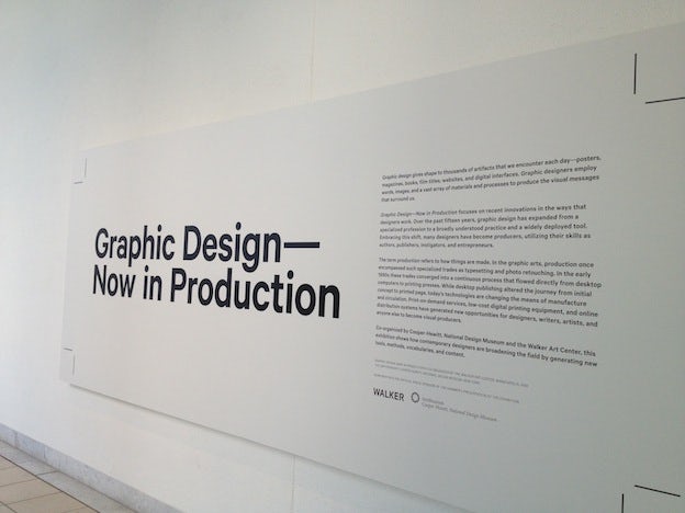
Graphic Design: Now in Production, the first major graphic design exhibition in the United States since 1996, takes inventory of the 2000s, exploring how graphic design has broadened from a very specialized profession to a widely used tool in this time, thanks to accessible software and a handy global distribution channel: the World Wide Web.
We had a chance to visit the exhibition, which is organized by the Walker Art Center and the Cooper-Hewitt National Design Museum, at the Hammer Museum in Los Angeles last weekend, and we thought we’d give you a virtual tour of some of its highlights.
Spanning the fields of typography, branding, infographic, book, magazine and poster design (not website design, interestingly), the show includes some pretty mind-blowing examples of out-of-the-box projects that likely never would have existed, or at least never found wide audience, before the 21st century. Let’s have a look.
Typography
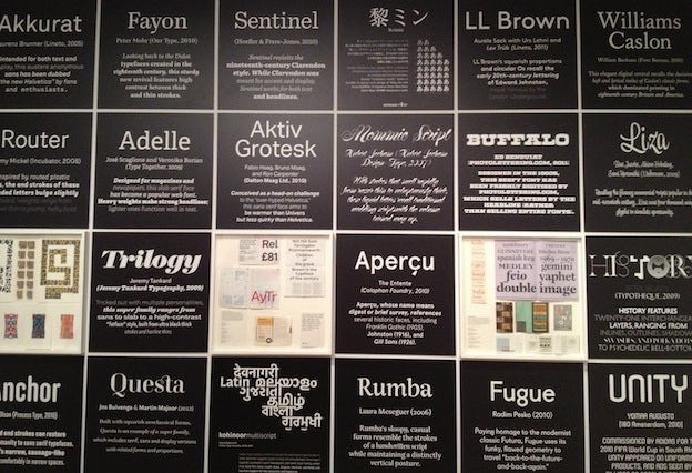
The world of type design, once an arcane practice reserved for a small and dedicated few, has undergone a veritable renaissance over the last decade. Thousands of designers try their hand at it, producing dozens of new fonts daily. Some projects, such as these, really stand out from the pack:
Christopher Clark’s project, Web Typography for the Lonely, offers a variety of typographic prototypes with quirky artistic features (in the example below, the dots float away with mouse-over). All the code is available on the site — check it out!

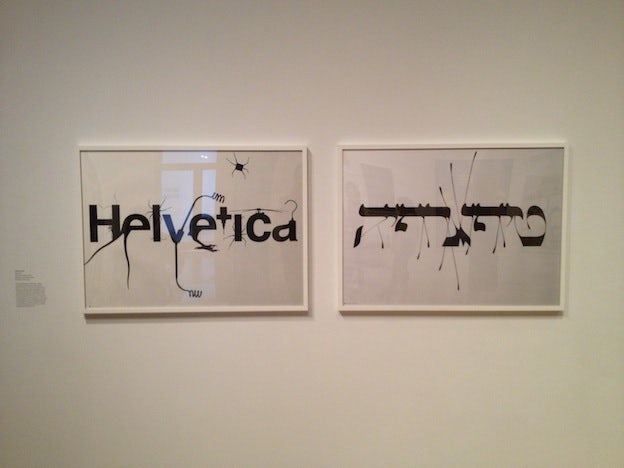
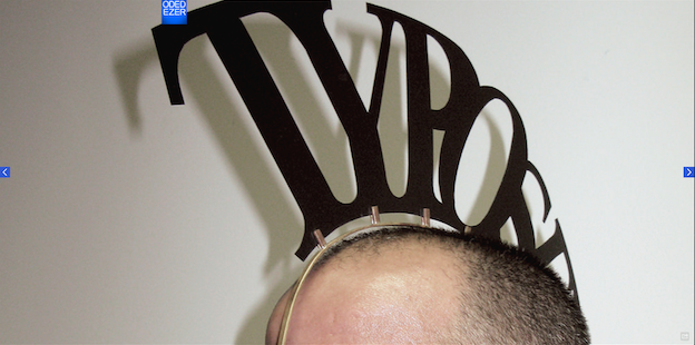
Israeli artist Oded Ezer merges typography with fine art, creating letter forms that morph into creatures or natural forms.
Or, yes, a wearable mohawk …
Branding
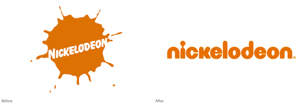
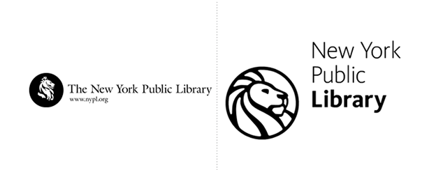
Brand New, a website devoted to happenings in the world of visual brand identity, is one of our favorite sources of logo news. One of their big focus is logo re-designs. This installation presents the viewer with several such re-designs — The Library of Congress, Nickelodeon and the New York Public Library, for example — and prompts him/her to vote for the “before” or “after” version by dropping a token in the corresponding slot.
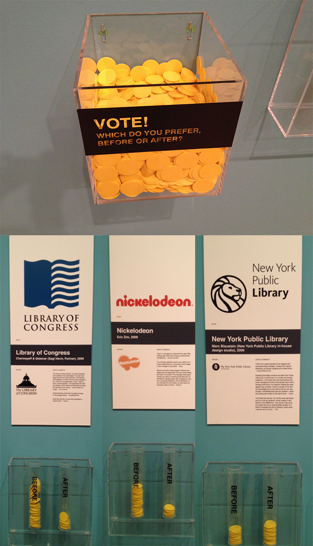
How would you vote on these (old designs on the left, new on the right)?

Infographic
Information design is certainly one of the industry’s hottest fields right now. Visualizing data is a tough business but also presents a lot of room for creativity. These designers, many of which present video media, have all made huge splashes:
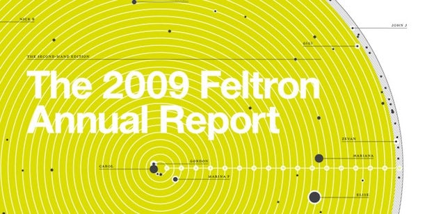
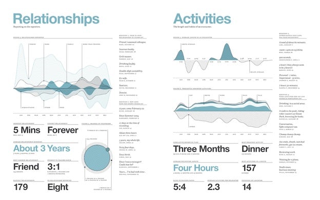
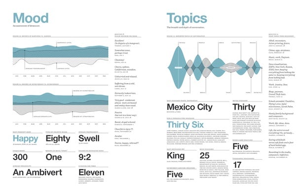
In 2005, Nicholas Felton began producing thick, detailed “annual reports”, not about a corporation or industry, but about his own everyday activities — number of songs listened to, miles flown, books read, restaurants visited and so on. These particular infographics, from the 2009 Feltron report, represent Felton’s various personal relationships and the nature of their encounters (length, mood, etc.) over the year.
Boston-based design studio Sosolimited created an algorithm that reads television soap opera closed caption transcripts in real time and distills out especially emotional or thematic content, then presents it as a moving typographic visualization.
Set Top Box from Sosolimited on Vimeo
Cognitive Media created this incredible flash-animated illustration of Sir Ken Robinson’s lecture, “Changing Educational Paradigms.” Easily one of the most gripping lessons we’ve ever received.
Book & magazine
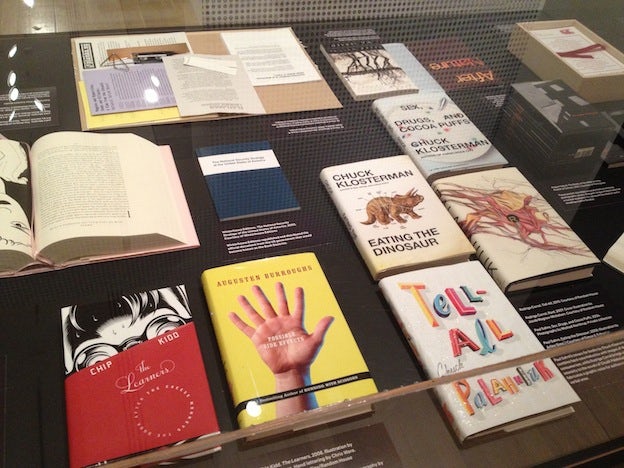
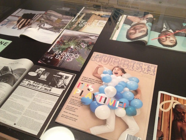
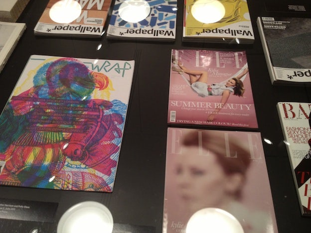
Over the last ten years, the world has gone more digital than ever before. And yet, the number of physical magazines in circulation has never been greater. Books and magazines are embracing the fact of their own material shape and size and the design possibilities that follow. The exhibition presented rows and rows of vitrines full of magnificent printed objects. Here is a small selection:
Poster
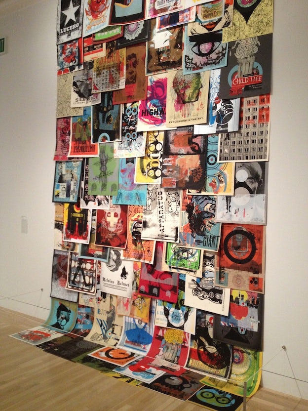
The poster is one of the oldest and most striking fields of graphic design. Over the years, it has encompassed government propaganda and, primarily, advertisement. Lately, though, designers are breaking from these imperatives altogether, designing posters for posters’ sake that circulate within an adoring and ever-growing community. Impressive stuff:
While working at Kinko’s in Amsterdam, Michiel Schuurman discovered the amazing possibilities of large scale, black-and-white photocopiers. His resulting posters pulsate with detail and activity, evoking the Op Art movement.
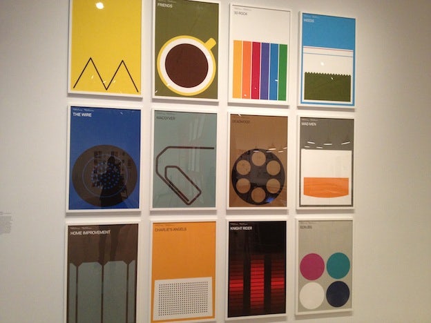
Vienna-based designer Albert Exergian takes minimalism to its absolute extreme, creating posters to represent iconic TV shows using as little imagery as possible — a telephone receiver for “The Wire,” a glass of Scotch for “Mad Men,” and so on.
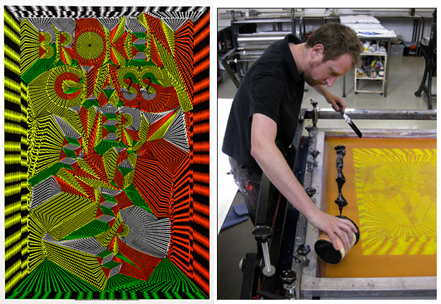
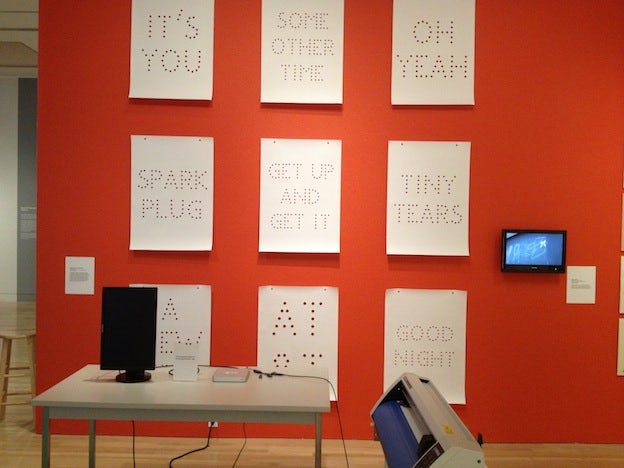
Many designers-cum-engineers are pushing limits by creating not one-off posters, but rather the tools and machinery behind them. Jürg Lehni and Alex Rich, for example, create script plug-ins for Photoshop that translate to analog devices like chalk-drawing robots or, in this case, a hole-punching machine.
In an awesomely unique technique, Daniel Eaton creates posters by arraying felt-tip markers face up, then laying posters on them, allowing the ink to seep through and create dot forms. He simply repeats the process until the ink wells are exhausted, producing a series of images each similar but not exactly the same.
Graphic Design: Now in Production runs through January 6 at the Hammer Museum.

