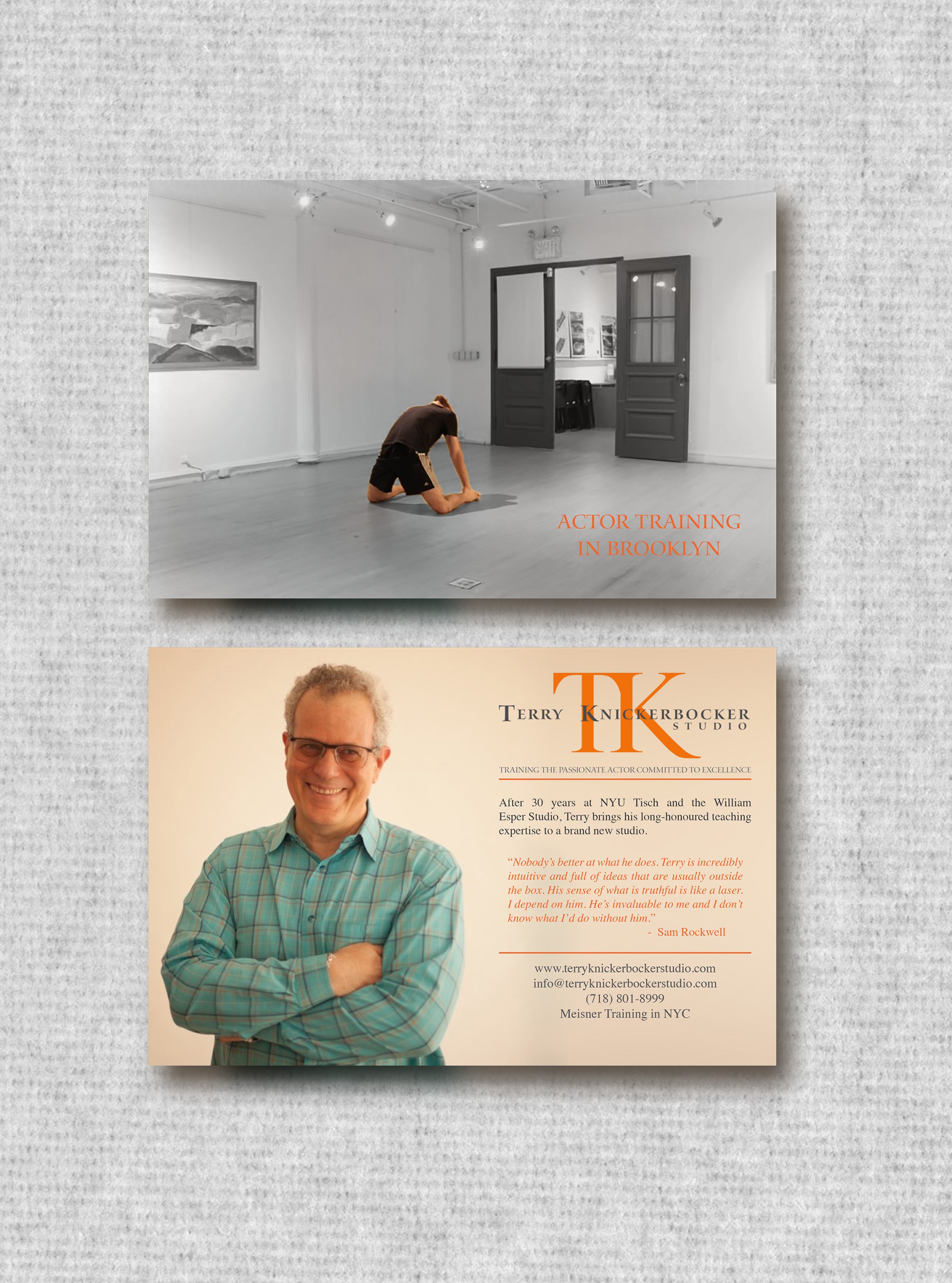
Flyer for Boutique Acting Studio
0
Criados na 99designs por Vista
The front image emphasises the double entendre of "actor training in brooklyn". It is designed to catch the eye and tickle the brain, whereas the rear is designed with a pleasant and informational rationale, yet in keeping with the brands look.
