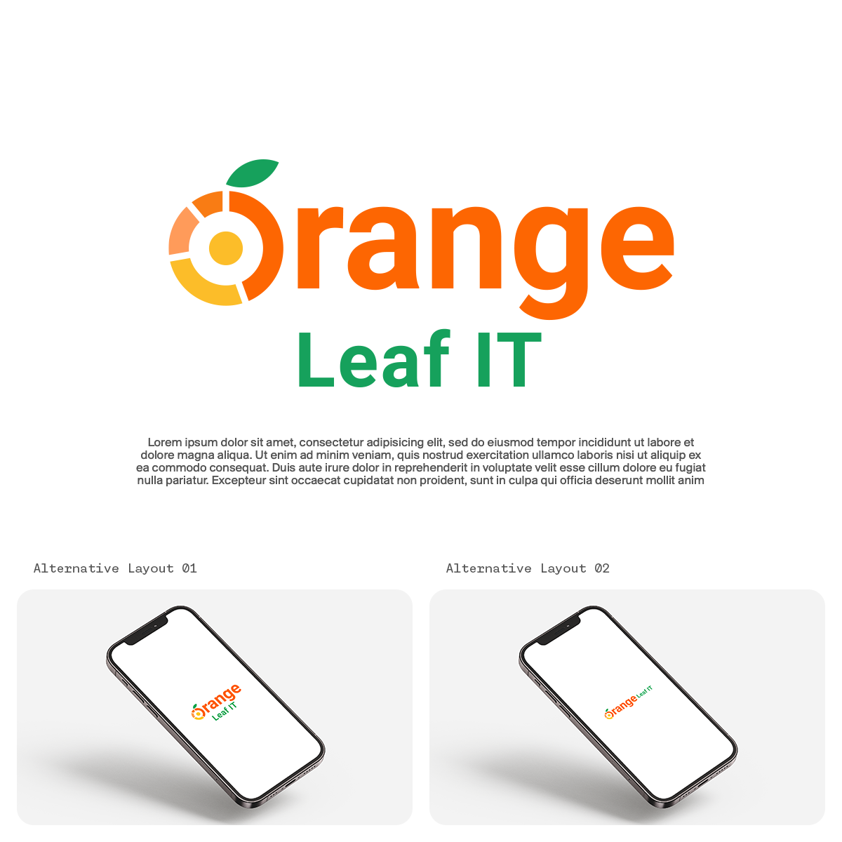

The Orange Leaf IT logo design concept embodies a harmonious fusion of technology, innovation, and natural vitality. The central element of the design is a stylized letter "O," meticulously crafted to represent the core values of the brand.
The modified "O" takes inspiration from both the visual language of pie charts, symbolizing data and analytics, and the organic beauty of an orange fruit. The outline of the "O" features segmented divisions reminiscent of pie charts, each filled with a gradient of vibrant orange hues. This not only alludes to the dynamic nature of IT solutions but also reflects the diverse and interconnected facets of Orange Leaf IT's services.
This conceptualized logo not only establishes a strong visual identity for Orange Leaf IT but also communicates the brand's commitment to the seamless integration of technology with the natural world, creating a memorable and versatile representation for the company's ethos and services.