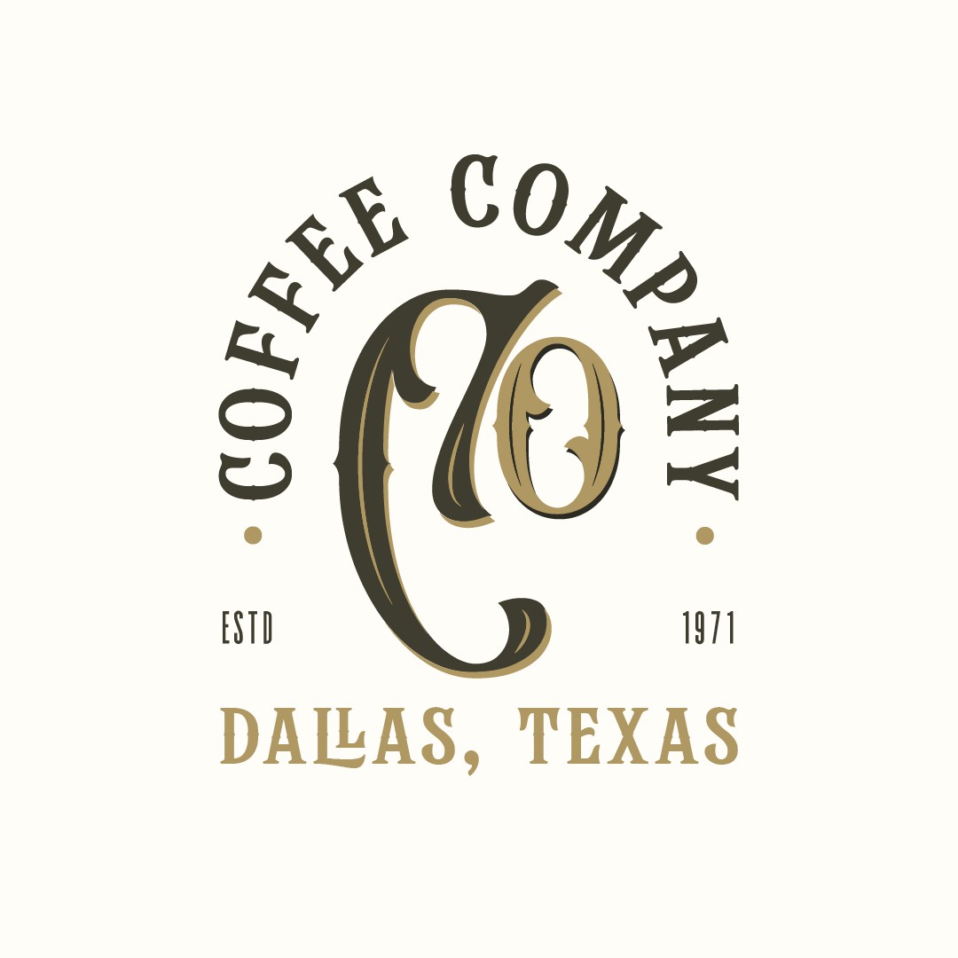
Proposal for Coffe co.
1
Criados na 99designs por Vista
With this Proposal the client already had a very specific graphic in mind, with the Co being the center of it all with the text around it. So fit the brief I just tried to give it a vintage label feel
