HiGuys Cannabis Logo Proposal

1
Criados na 99designs por Vista
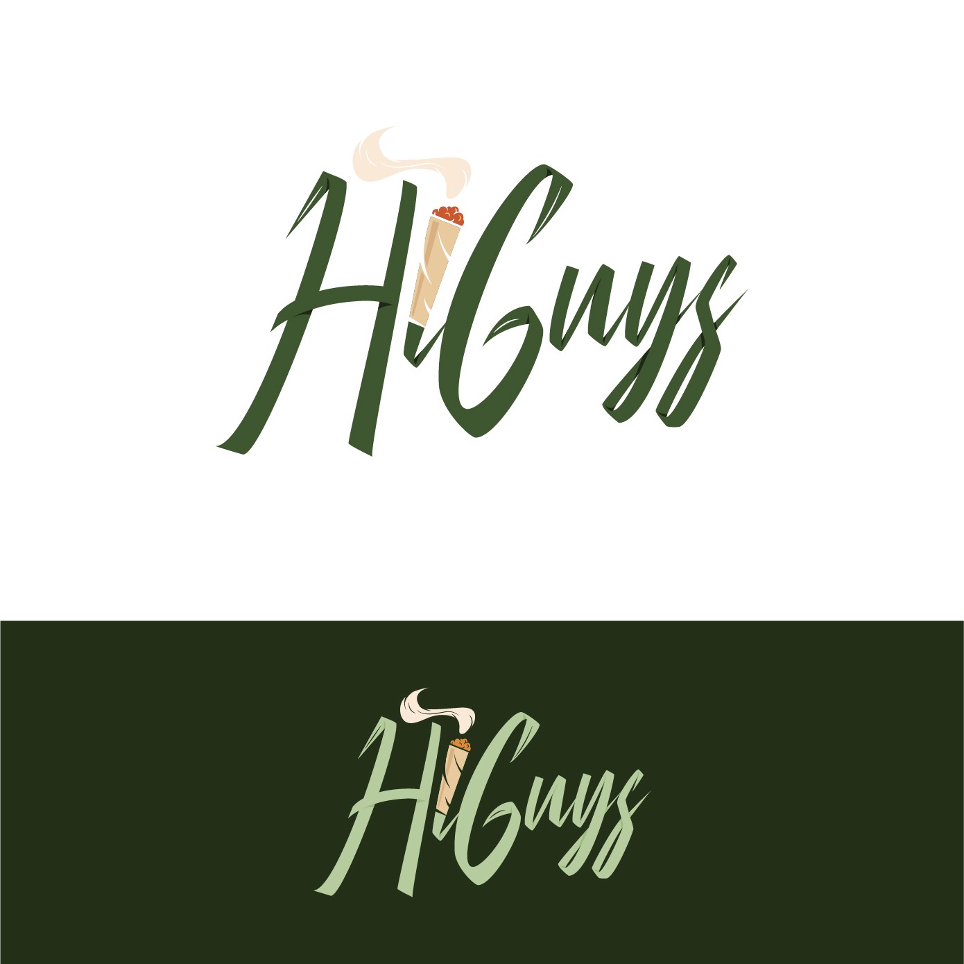
Since the beginning, the client expressed that he wanted the "I" to be a cigarette or a joint.
For the rest of the design, I wanted the letters to give a plant feel without being too on the nose about it. Overall my aim was for the design to work also in a monochromatic way