Bold Logo Concept for Coasttocoast

0
Criados na 99designs por Vista
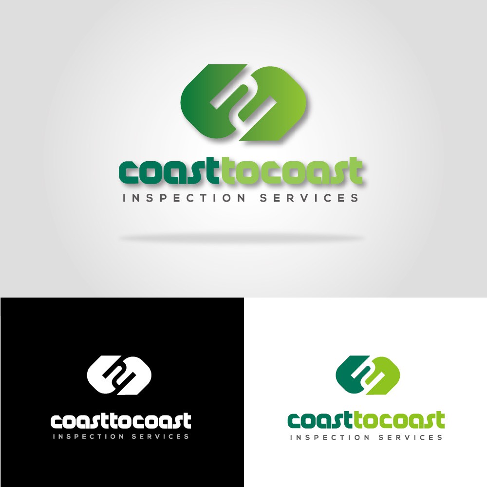
I used a strong, bold and rounded font for the company name to give a distinct and reliable feel. Also I matched the slogan ‘Inspection services’ in a simple and light font so that it neutralizes the bold company name. For colors, I developed from the previous logo, however, I tried to make the light green and green color more bright and vivid so that the logo suits the forward-looking brand, Coast to coast. Additionally, I put a symbol with a figure where the two ‘c’s meet. This symbol represents linked pipes, which is the most related product for the company and shows number '2' with two C, and oblique ends signify unlimited connection of pipes.