
The goal was to create a meaningful logo with elegant, luxury, premium features. None looks like this among the logos researched, turning it very distinctive among the competition in Tennessee. An unique symbol/iconography as a brand. A local Franklin TN company but with an international and powerful feel.
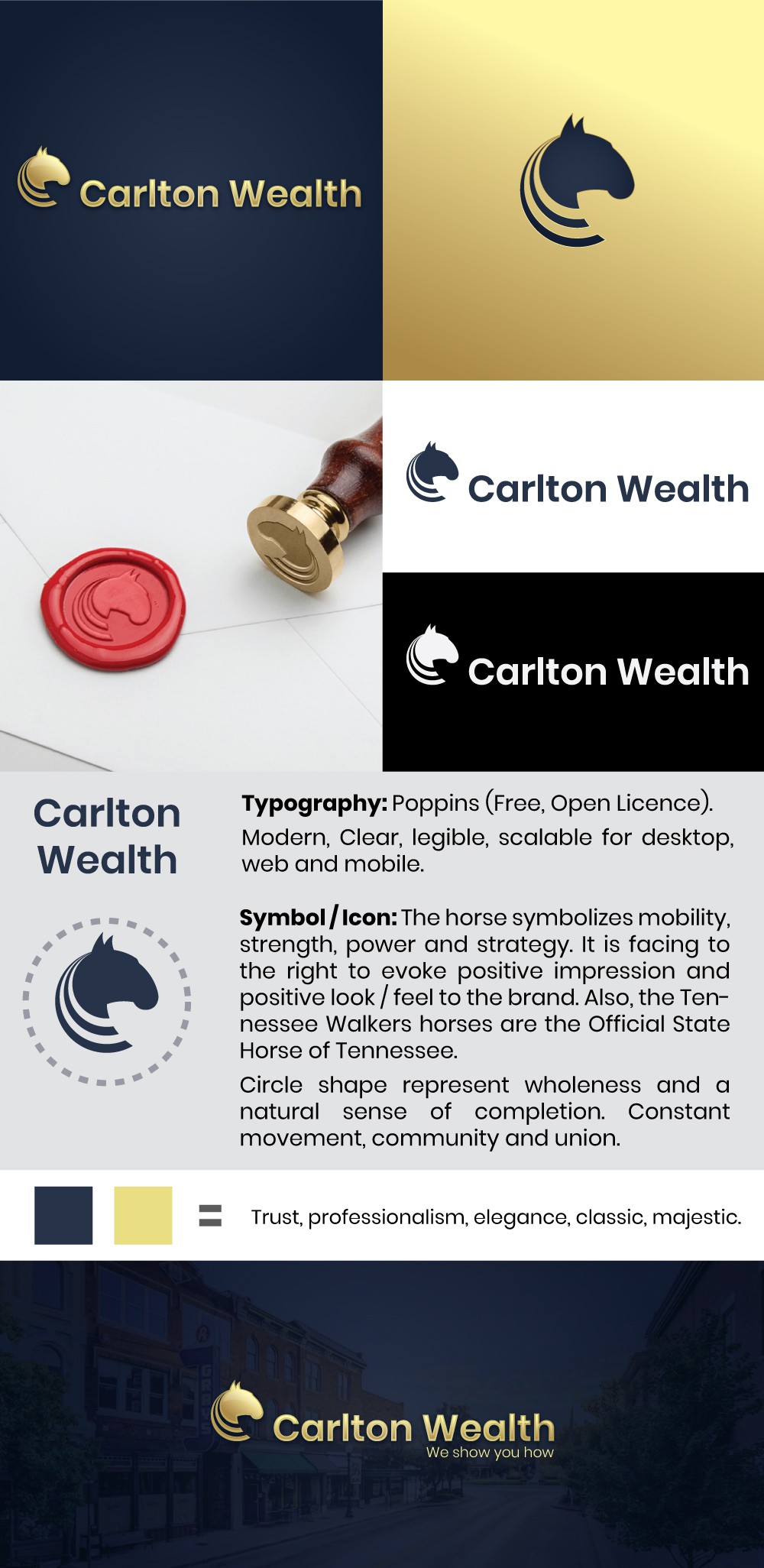
Typography: Poppins (Free, Open Licence).
Modern, Clear, legible, scalable for desktop, web and mobile.
Symbol / Icon: The horse symbolizes mobility, strength, power and strategy. It is facing to the right to evoke positive impression and positive look / feel to the brand. Also, wanted to translate the elegance of the Tennessee Walkers horses, which is Official State Horse.
Circle shape represent wholeness, constant movement, community and union.
Slogan: We show you how.
This logo represents the main pursues of the company followin its Philosophy, Fiduciary and Communication. The company assists its clients in a different way, a refreshing way.