Bold logo to make people feel hungry

0
Criados na 99designs por Vista
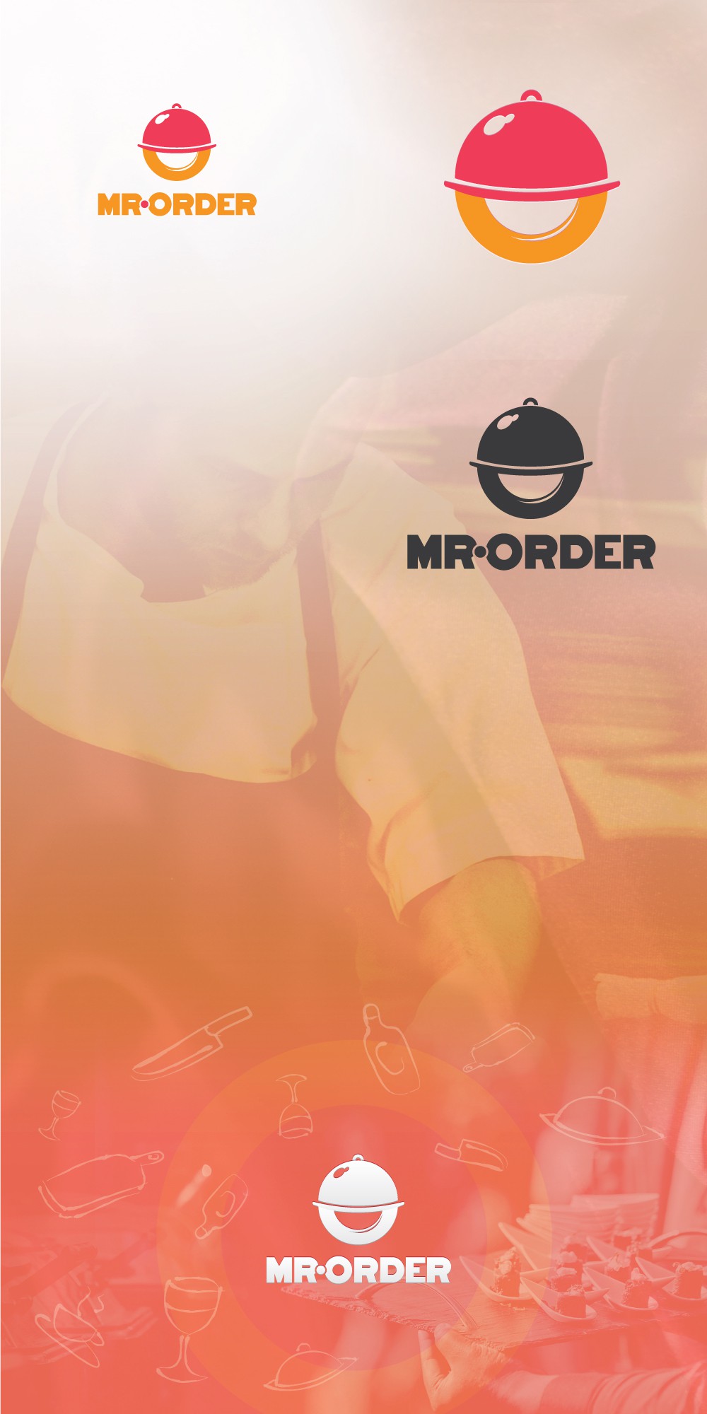
The following mark is minimal and straighforward. It is a modern, clear, legible, scalable logo for desktop, web and mobile. Shows an O from Mr. Order and a catering tray on top which also shows a smiley face/friendliness. Circular shape conveys wholeness, constant movement, community and union.
Colors: The mix of red and yellow is appropiate for food services, to awake the taste buds of costumers.
Typography: A modified version of Monoton font (Free, Open Licence, Google Fonts).
Have placed additional iterations with plain black and white tonalities bellow this sample.