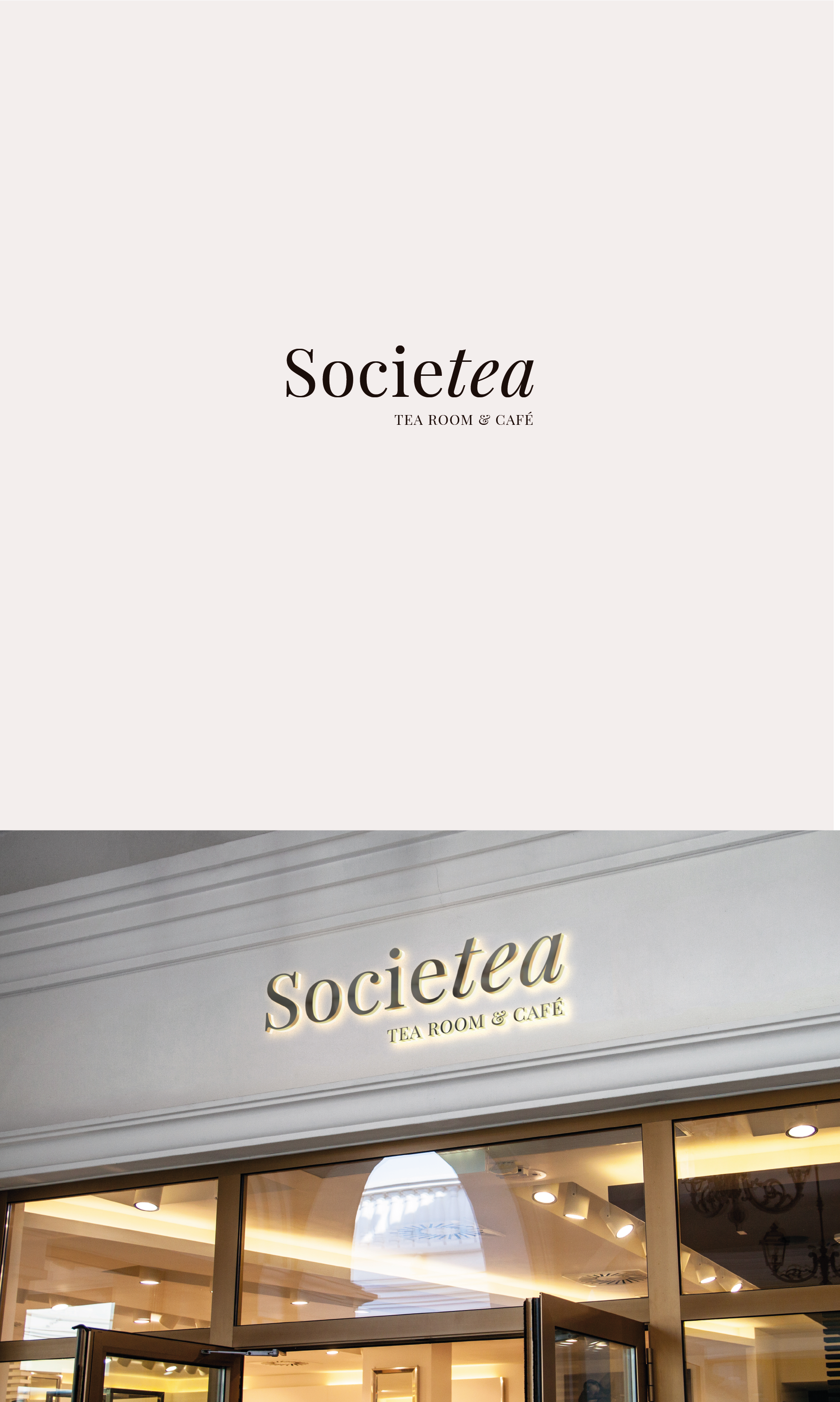
The main problem the client had was that people had trouble reading apart the name, hence why the logo emphasizes the word tea using a typography that serves the brand's purpose