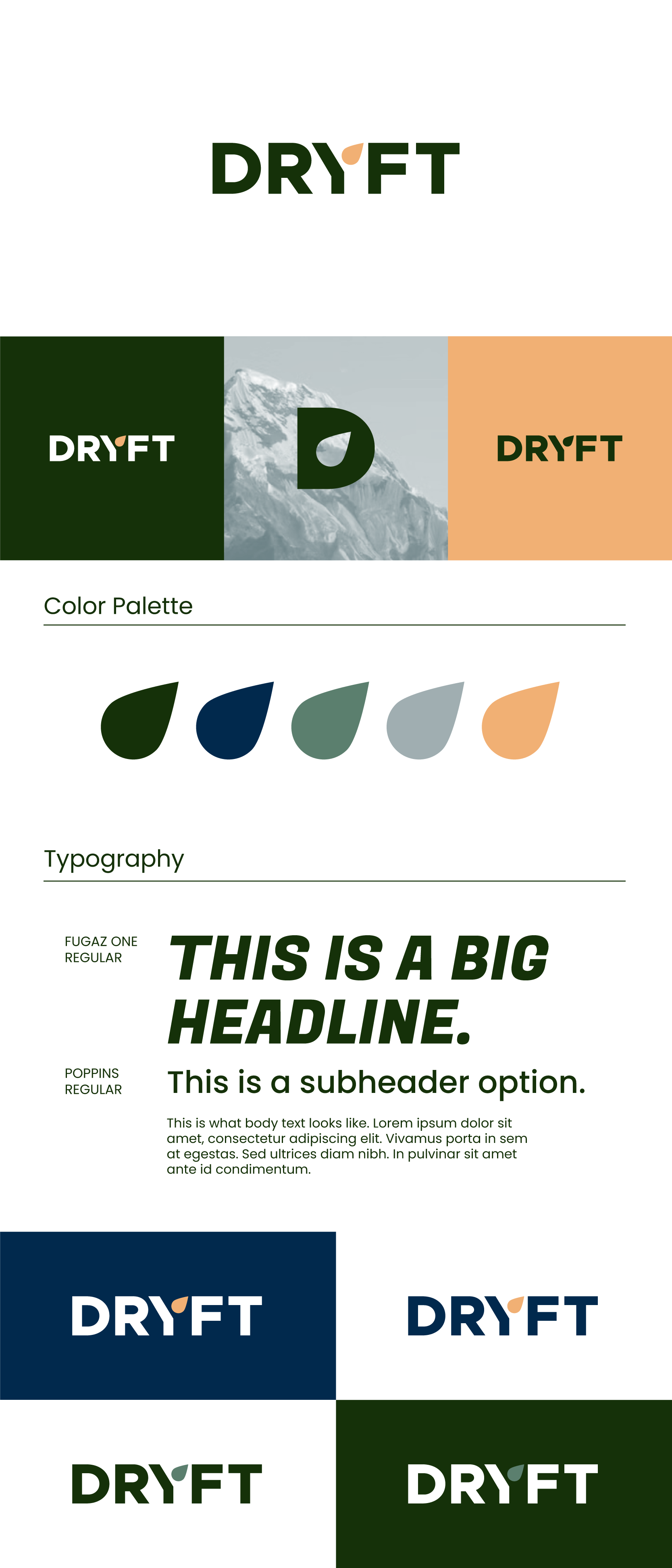

A clean, contemporary wordmark logo where a stylized droplet shape emerges from the ‘Y’ to subtly represent the brand’s focus on calming, alcohol-free beverages. The drop symbol embodies purity, relaxation, and natural wellness, while the bold, geometric sans-serif type communicates modernity and trust.
Target Audience:
Crafted for health-conscious consumers, fitness enthusiasts, busy professionals, caregivers, and sober individuals looking for a clean, sophisticated alternative to alcohol for evening relaxation, restorative sleep, and social occasions.
Result:
A minimal yet distinctive identity that balances approachability with upscale wellness energy. The mark works effectively across product packaging, digital platforms, lifestyle content, and social media — reinforcing DRYFT as the natural, feel-good drink for modern, mindful lifestyles.