Logo design for a physiotherapy practice in Germany

26
Criados na 99designs por Vista
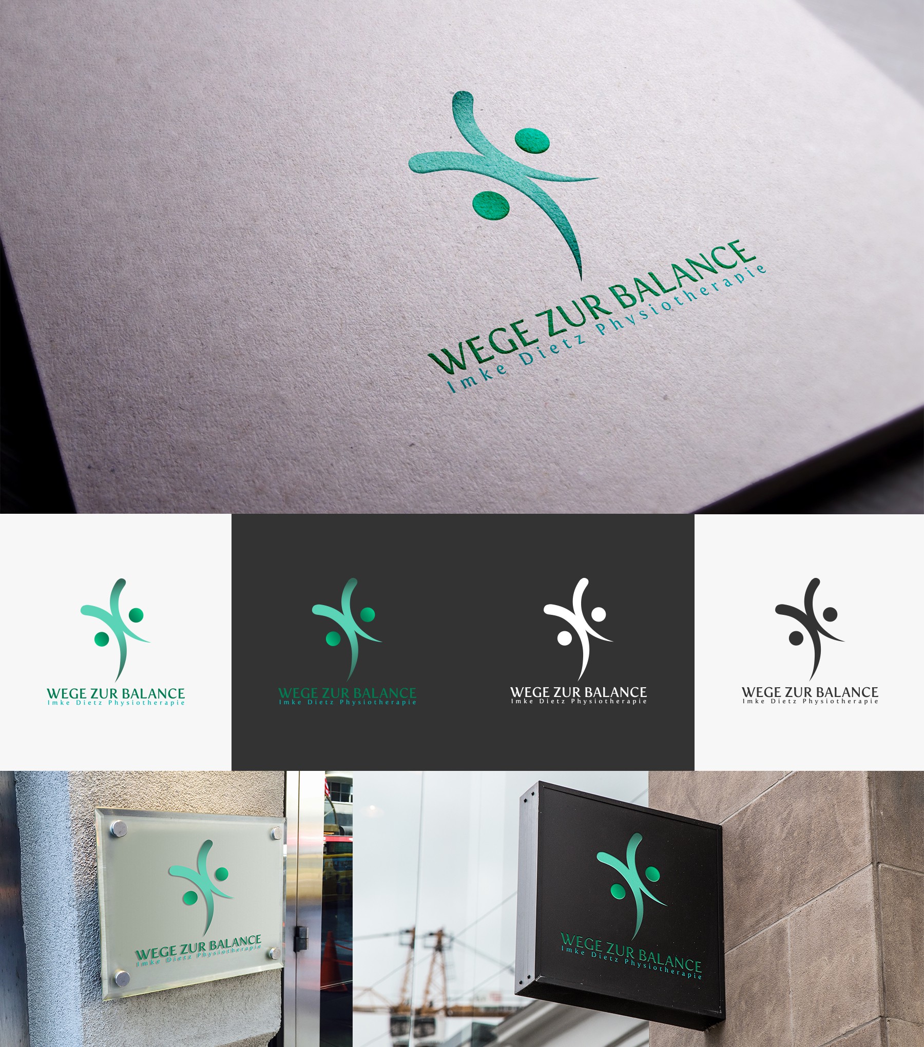
Contest holder wanted something feminine, sophisticated and abstract. In addition to the name, they wanted to see some kind of symbol or form incorporated in the logo.
The curves and dot are representing a human but then I decided to add another dot and rotate the human-like figure to get some abstract symbol and achieve balance.
Font I used is serious and sophisticated and matching for the design.
I think this logo is suitable for a physiotherapy field of work and it's promoting health and well-being.