Fashion luxury brand

0
Criados na 99designs por Vista
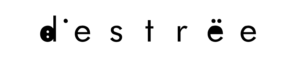
For me the key element of the brand are the dots in the e letter. It gives a character to the text whith whom we must play and set as the brand identity.
Here I decided to put the ":" dots inside the D as an introduction to the rest of the name