
The app allows mine personnel to quickly assess the productivity of mining operations on their iPhone. The data collected will be stored on the web and made available for customers to review and generate customized reports.
I'm designing according to Apple's Human Interface Guidelines and best practice for mobile.
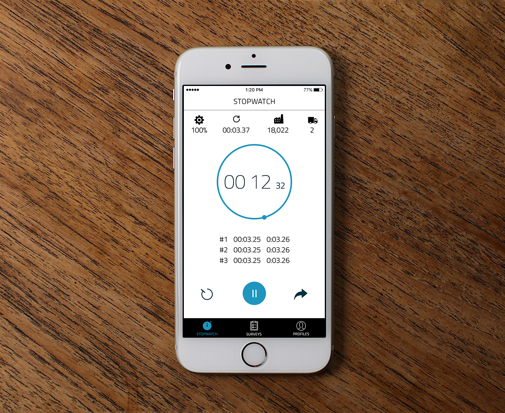
To help the customer grow his consultancy business, I've personally elaborated a beautiful and functional design.
I've designed a clean and simplistic UI to enable users accomplish their tasks with ease.
I've worked carefully on iconography, so it is bold and vibrant. Icons are powerful and understandable.
I'm leveraging a preferred color scheme to build up the visual hierarchy.
Blue and black hues not only look enticing, but furthermore they will provide the optimal reading experience under direct sunlight.
Simplicity and high-contrast readability work well together for a pleasant user experience.