Criados na 99designs por Vista
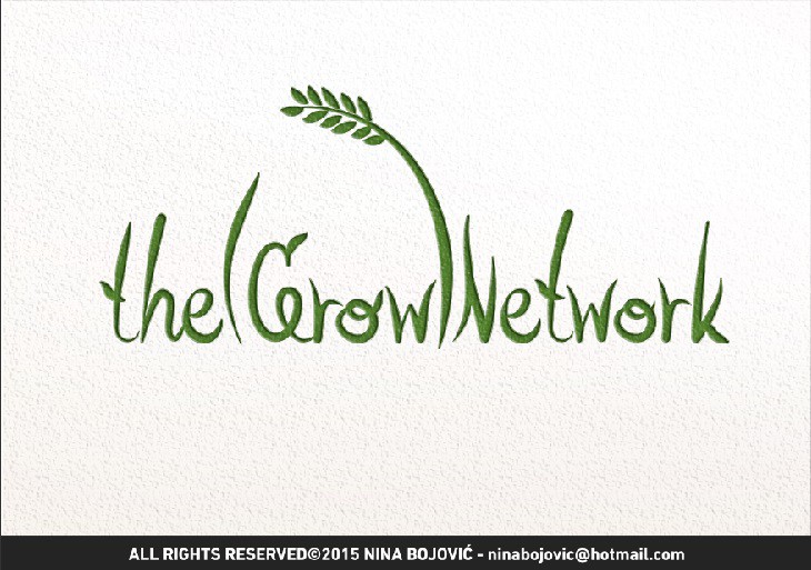
I wanted to make the length of the name as an advantage by shaping the words to look like a stylized grass - because creating logical shape out of a meaning of a long word makes it more appealing to be read and it's an universal symbol for growth and nature, yet simple enough to follow print and practical uses the logo needs. It's readable in all sizes and in black and white, where the wheat can be later used as a draft base for creation of a trademark.
