Label Design for Viva Naturals

14
Criados na 99designs por Vista
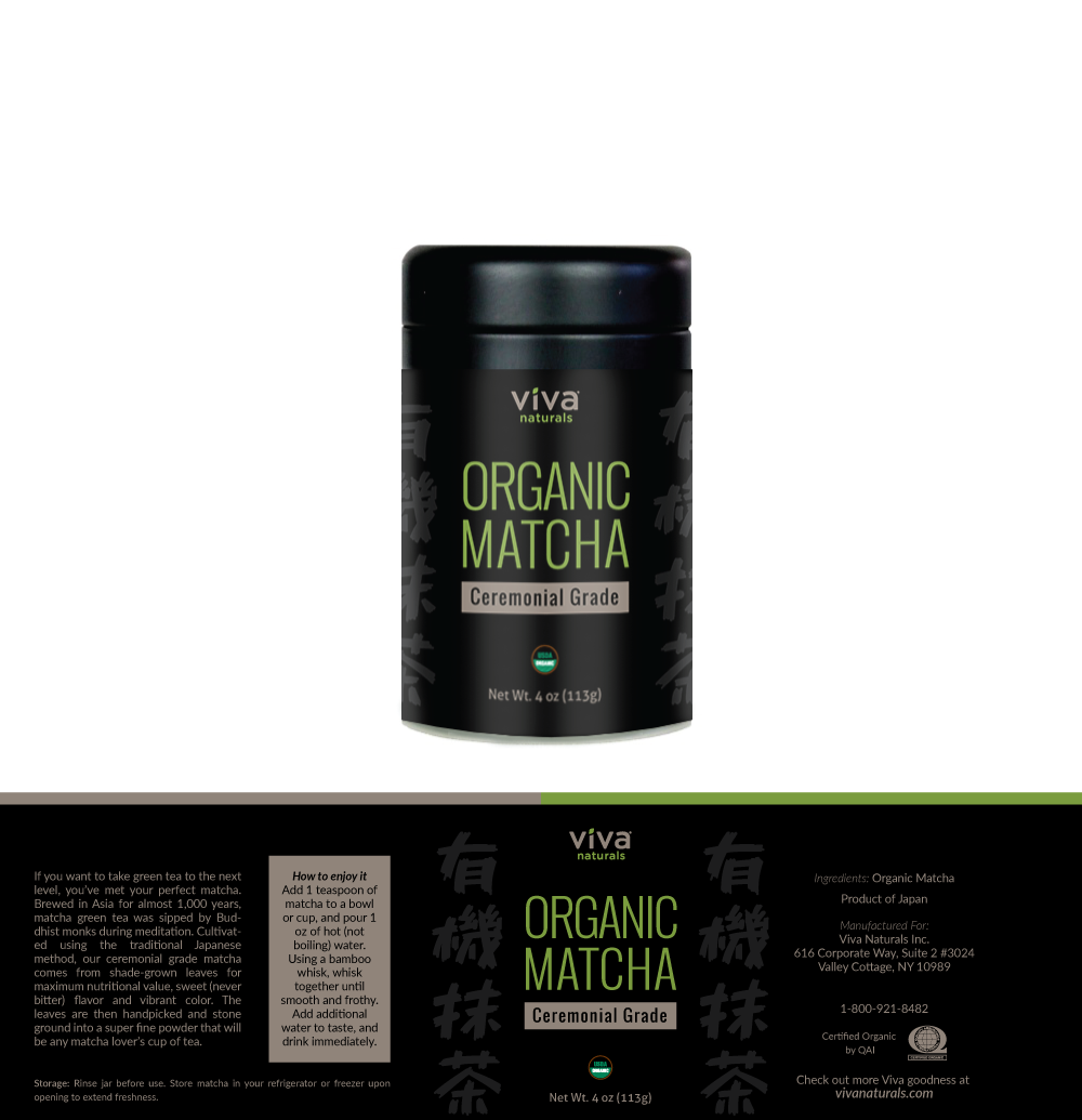
Viva Naturals logo already have a good color pallet to represent premium natural products, so I used it to also make a stronger link to the brand (making peopple to remember it more easily) and added the black background for the 'premium touch'. Since this is produced in Japan the layout is inspired by the japanese diagramming. Also the japanese letters on the background means 'organic matcha'.