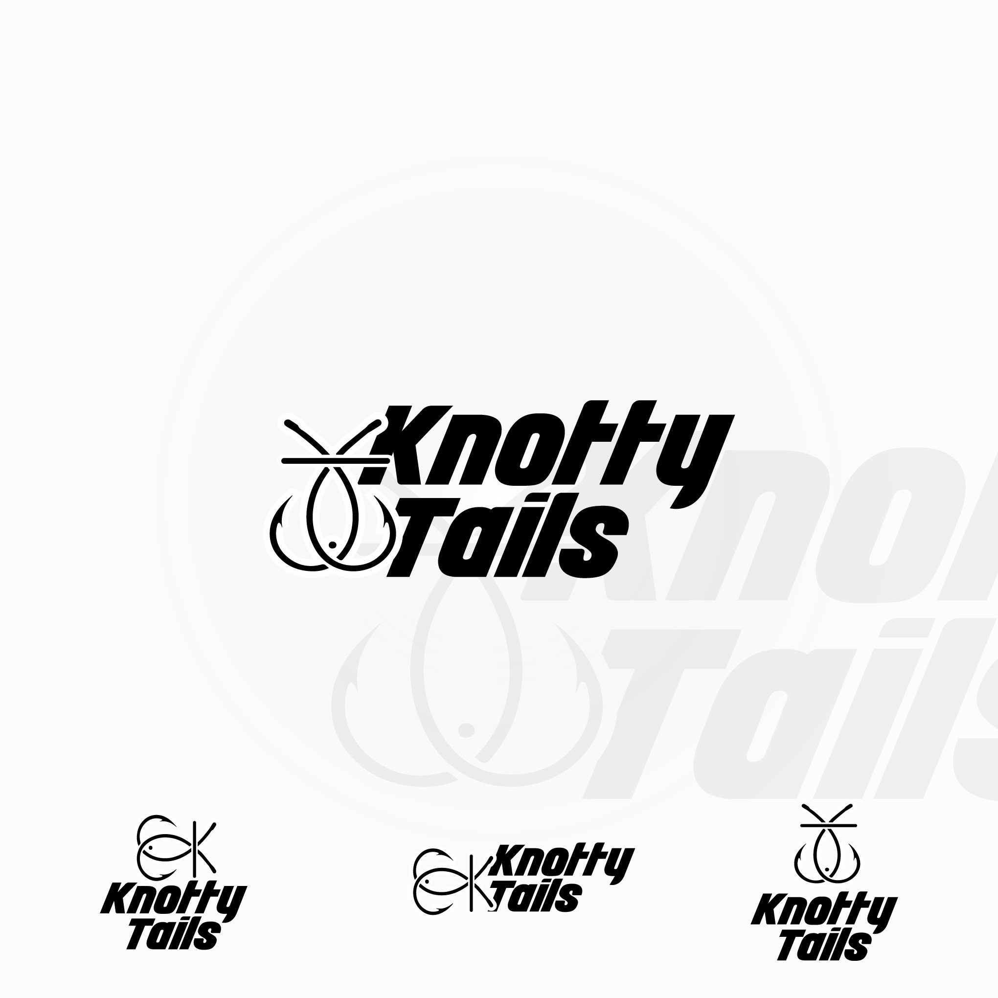
It's more on the simplistic lines. The text is sporty to have that masculine spirit and the logo(mark) is formed by 2 hooks. Making a fish. As well as a line bisecting the fish's tail as the letter "k".