A versatile logo for a passionate production company

0
Criados na 99designs por Vista
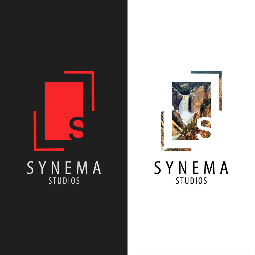
Synema wanted a design that represents their passion for filmmaking, whilst remaining professional. So I wanted to create a versatile logo that can be heavily customised but still appear recognisable, and unique.
On the surface, the 'window' and outer lines can be seen as the framing of a shot. On a deeper level, the window represents the productions of Synema, and the lines represent the out-of-the-box thinking used to create them.
This result is the second version of the logo, and is more simplified than the original. I believe the simplicity of this version is what allows it to be so versatile.