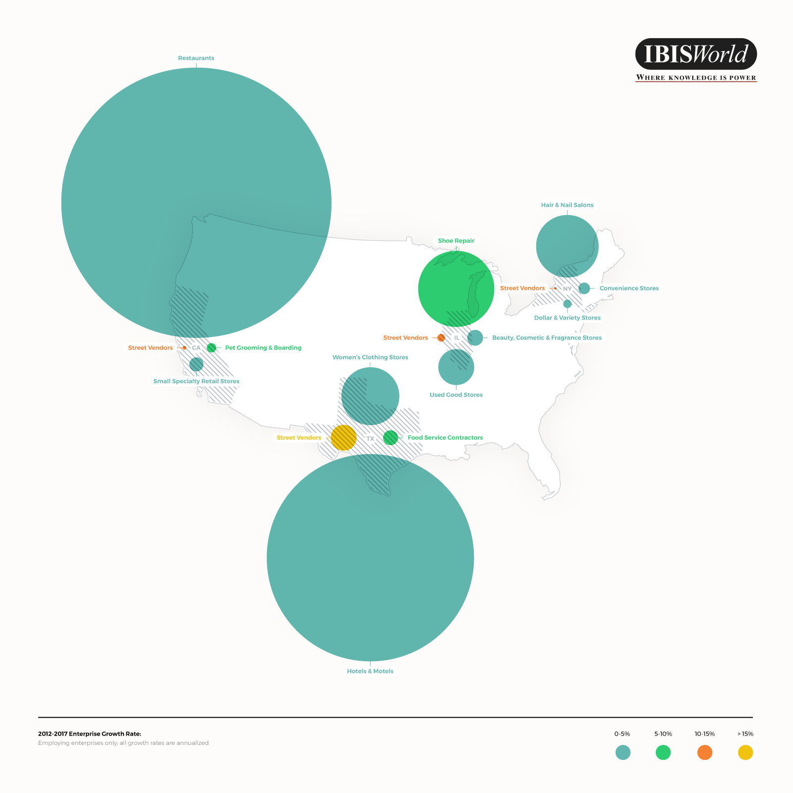
Research visualization that shows market size and growth rate by industry.

1
Criados na 99designs por Vista
Visualization showing growth rate and size of bricks and mortar industries across four US states. To me a true visualization shows one, no more than two attributes graphically. I really wanted to focus on the size of the market, whereas, the secondary element being growth by colour. Visualisations really come to life with interaction - then we can really engage.