Affiliate Program Profile Page Design

13
Criados na 99designs por Vista
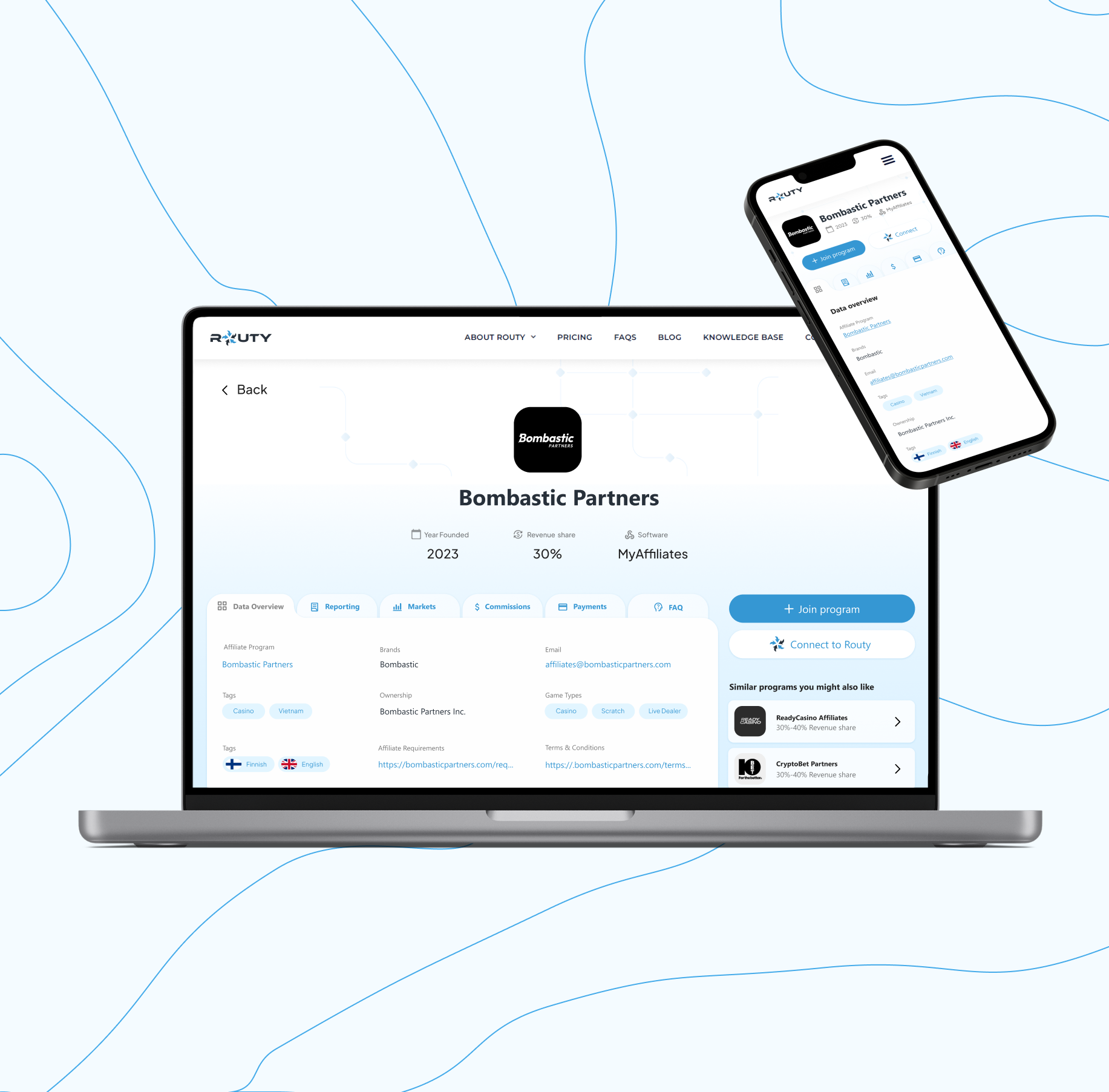
Affiliate Program Details Page had a lot of data to be displayed, which made it challenging to make it clean and readable for the user. I approached the design by splitting the data into meaningful tabs that can be quickly skimmed through both on laptop as well as on mobile. The content also uses visual elements to make it more readable.
The CTA has a clear highlight color that attracts user's attention. Finally to add more customized experience for the user, similar programs are displayed next to the profile.